Among the many debates that follow elections, there is one that usually gets most attention among data journalists and people with an interest in data visualisation: electoral maps. This is not a purely aesthetic debate, as both newsreaders and political pundits make sense of election results through these maps, reaching often debatable conclusions.
A common one, for example, is the idea of a “country divided” as highlighted by Giuseppe Sollazzo in a post focused on maps published after the 2018 election in Italy. Maps with the north of Italy completely green have been common after the latest European elections (see e.g. such maps shown in this post by Alice Corona).1
Another highly criticised but common feature of electoral maps is that of deciding the colour to give to a region based on the party that got most votes, which can be amazingly misleading in votes such as the European elections based on a proportional system; as appears from these maps by Filippo Mastroianni, there are more nuanced ways to show the distribution of votes.
Personally, I believe that geofacetting conveys information most accurately in proportional systems, but the result is admittedly visually unimpressive and accordingly unlikely to ever get traction in the media.
Joining the #dataviz #ddj debate on electoral maps about #ItalyElection2018 results.
— Giorgio Comai (@giocomai) March 8, 2018
Criticism: the most common map with electoral results (north=blue, south=yellow) has lead to misleading analyses (country=divided)
Here's a quick reply pic.twitter.com/eyPRRT8cuc
Another aspect that does not get much attention in Europe, but features prominently in debates on US electoral maps, is the question of how to deal with areas with different population density: geographic maps show space, so a vast desert or mountain area with few residents looks more prominent than a densely populated urban area which is, electorally speaking, much more influential.
Spotted: A map to be hung somewhere in the West Wing pic.twitter.com/TpPPDyNFtE
— Trey Yingst (@TreyYingst) May 11, 2017
Ultimately, different maps show different things, and different visualisations work best to convey specific features of an election.
Among the many maps around about the latest European elections, I haven’t seen cartograms. They are unlikely to ever be considered the “best” or “most beautiful” electoral maps, but I do feel they convey some information more effectively than other types of visualisations.
So… get ready to a fancy ride exploring the 2019 European Parliament elections in Italy through cartograms!
Who has the right to vote, who actually votes
The geographic shape of Italy is well known. But if each person occupied the same amount of land, the shape of Italy would be slightly different: densely populated metropolitan areas such as Rome and Milan would appear to be bigger, and relatively sparsely populated regions such as Sardinia would appear to be smaller. How does this play out in time of elections?
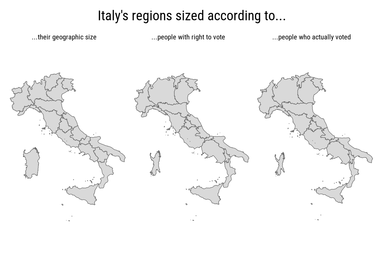
What is this?
- on the left, a map of Italy as we know it
- in the centre, regions keep their location, but are resized according to the number of eligible voters: the map in the centre broadly reflects population density, super-sizing regions with big metropolitan areas (e.g. Lombardia, Lazio, and Campania), and making sparsely populated areas such as Sardinia and Trentino-Alto Adige/South Tyrol look much smaller
- on the right, we see a map based on the number of actual voters. If every actual voter occupied the same amount of land, Italy would more or less have the shape it has on the right. Low turnout is what makes for example Sicily look much smaller than it would otherwise be.

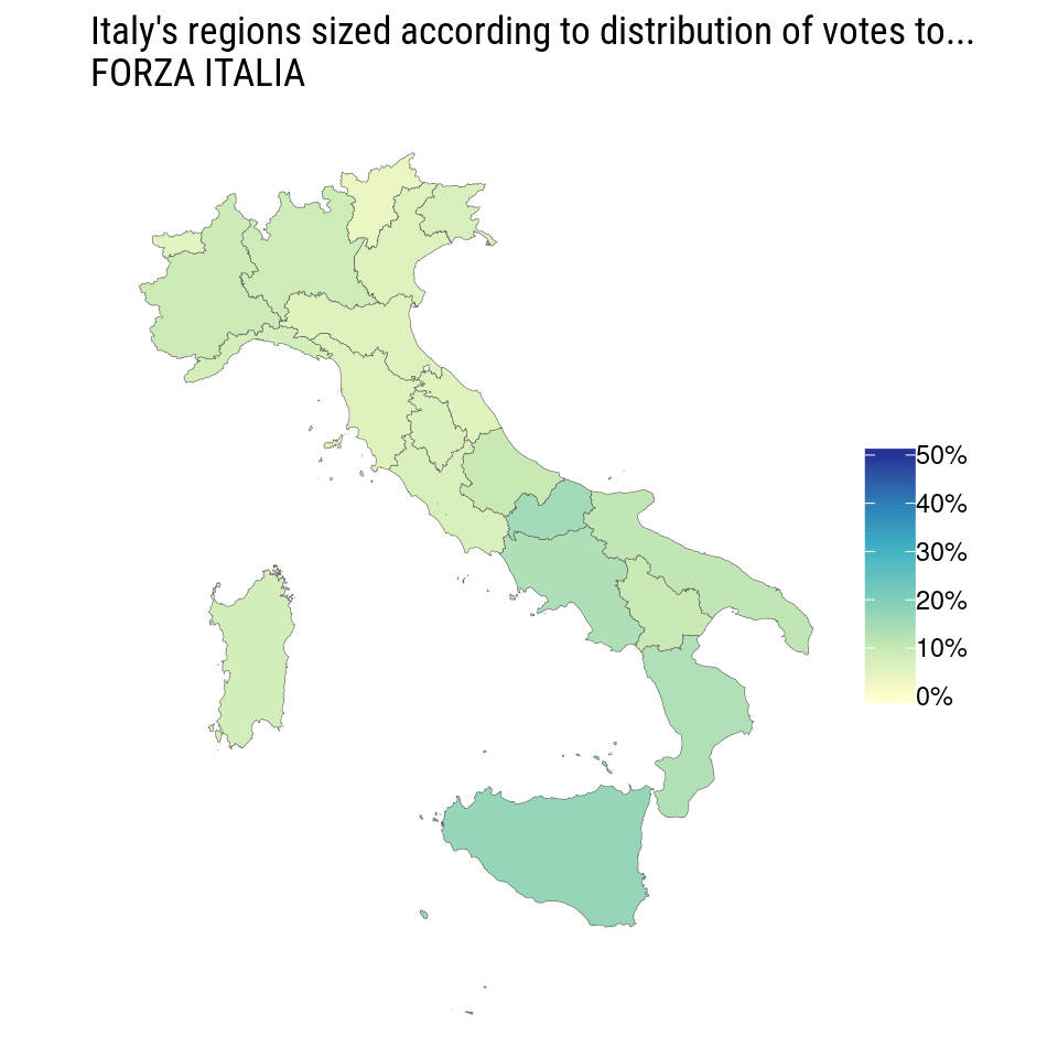
One Italy for each party
There are different ways to look at the electoral fortune of different parties. The following maps outline their relative success across Italy’s regions. Each of the maps includes only voters of a given party, and their purpose is to show the geographic distribution of voters for each party. To clarify: if a list had exactly the same percentage of votes in each region, its map would look exactly like the geographic Italy we all know.

The map shows some aspects that have featured in analyses of the vote, including the geographic specularity of the electoral success of the two ruling parties): Lega did better in the north, Movimento 5 stelle did better in the South.
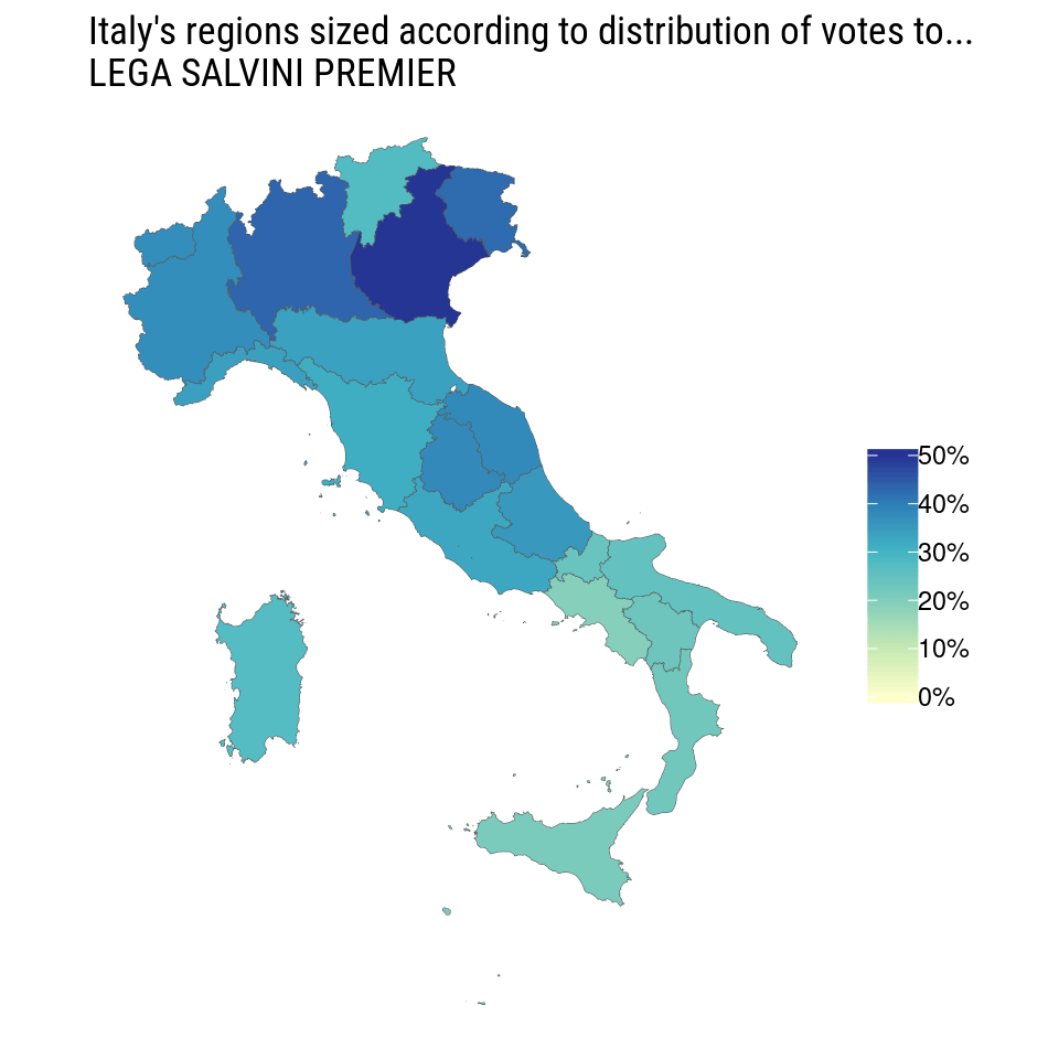
It also appears how Partito Democratico performed best in Tuscany and Emilia-Romagna, and how Forza Italia did best in the South.
What if, rather than looking at the share of votes, we look at the number of actual voters for each party? The number of people that they actually convinced to come out and vote for them?

These maps shows how all parties struggled to get people from Southern regions to come out and vote for them, so even parties such as Movimento 5 stelle who performed better in relative terms in the South, end up with a rather even distribution of actual voters across the peninsula.
Cartograms: but why?
Cartograms are not the most effective way to present who got elected. They are straightforward and complicated at the same time: they istinctively make sense, yet detailed explanations are needed to clarify what exactly is going on.
These cartograms are also one of those cases when animated maps outperform their static counterpart, as they make it easier to compare changes in a given part of the country, and do not require glancing back and forth.
Overall, they offer a rather effective and intuitive way to show regional distribution of votes. Should we be seing more of them?
Source code and data
Electoral results and geographic data have been retrieved and matched as detailed in this repository. Shape files for Italian regions have been taken from Italy’s statistical office ISTAT. The R source code that generates this post and all the maps is available on GitHub.
You are free to re-publish or adapt these maps. If you do, you are kindly invited to acknowledge the source - Giorgio Comai (OBCT/EDJNet) - and include a link to this post if pertinent.
For a review of more detailed and more nuanced maps that appeared on print media in Italy, with a particular focus on regional media, don’t miss this post by Isaia Invernizzi.↩