A couple of weeks ago, the European Data Journalism Network (EdjNet) released a new dataset including yearly average temperatures between the year 1900 and 2017 for over 500 cities across Europe, and made it possible to find key data on each of them through an interactive web interface. Since these are lenghty and meaningful time series, I decided to use them to test-drive data animation with R with ggplot2+gganimate.1
About the data
Through the analysis of data made available by the European Centre for Medium-Range Weather Forecasts (ECMWF), and by harmonising historical time series with recent data obtained from a variety of sources (satellite, weather stations, buoys, weather balloons), the resulting time series should be more robust to changes on the ground (e.g. if a weather station was on the outskirt of a city, but then new buildings and roads were built around it, temperatures for more recent years would likely overestimtate the increase in temperature; not with this method). Check out this piece published on EdjNet’s website, or check out the code published as a Jupyter Notebook to find out more about all the details of data processing.
Before diving into the data, here’s a few more details that should be kept in consideration:
- the figure for each city is obtained by averaging out data points for areas of about 80 square kilometers. As a consequence, the data refer to the city and its surroundings, which likely has a substantial impact on the data, in particular for cities that are along the coastline or located next to high mountains.
- throughout the investigation, the authors compare 20th century average data with 21st century average data, so when they say “one degree warmer” they mean that the average temperature for the period 2000-2017 is one degree higher than the average temperature for 1900-1999.2 This is rather unusual, as most reporting on climate breakdown refers to increase in the temparature since “preindustrial levels”, which mostly refers to the second half of the 19th century.3 While this choice likely reduces the figure on warming when compared to other studies that refer to “preindustrial levels”, this also means that having the whole time series we can decide to use other cutoff dates, and to compare - for example - the first 30 years of the dataset with the last 30. In this post, I’ll however stick with the original definition.
A quick note on contents before giving way to the code: in each and all cities included in this investigation the temperature has increased between the 20th and 21st century, in many by more than one degree. Broadly speaking, this seems to be in line with the worrying analysis presented by IPCC in early October.
Get and clean the data
A spreadsheet with temperature per year and location has been made available by EdjNet. The data for each city have been published as separate sheets, so I have first downloaded the data as an .xlsx file to speed up processing, and then merged all the data in a single data frame in the long format. Selected indicators for each of the cities has been published in a separate spreadsheet. This second file is not needed to create the graphs included in this post, but it can be useful to check if everything looks in order with the data, or to place the data on a map, as it includes also longitude and latitude for each city.
N.B.: All of the the code is available as a repository on GitHub
Making a static version of the graph
The following graph has been made with ggplot2. Again, you can check out the code at this link. It’s quite a lot of typing, as all graphic components need to be defined separately, but the resulting graph looks nice, and, fundamentally the very same code can be applied to all cities included in the dataset without further changes. This example graph shows Granada, which is the city in Europe were the temperature grew most.

Animate the graph
Thanks to the excellent work done by Thomas Lin Pedersen on gganimate, it’s now a single line of code to animate the above graph.
staticOneCity +
  transition_reveal(id = City, along = Date)
Again, this is all the code needed to transform the above static graph in the following animated GIF:

This looks nice, but I feel it has one major shortcoming: since the final frame disappears instantly, the viewer has effectively no chance to look at the time series in its entirety. As a workaround, we can extend the range, and tell the animation to run for a few more decades after 2017; since there are not data for later years, we get to see the final frame for longer.4
staticOneCity +
  transition_reveal(id = City,
                    along = Date,
                    range = as.numeric(c(1900, 2080)))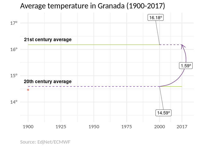
Export as high quality video
If you don’t like GIF, or you need to include this graph in a video clip, you can export the same in high quality video formats; thanks to the latest av packge by rOpenSci, it’s now easy to export the graph in high quality video formats (see the blog bost announcing the release of the package). This is the code needed to export the above animated graph as an high quality mp4.
if(!require("av")) install.packages("av")

animate(animatedOneCity,
        renderer = av_renderer('animation.mp4'),
        width = 1920,
        height = 1080,
        res = 250,
        fps = 25,
        nframes = 300)
Bulk create graphs
It is now possible to recreate the above graph for all the cities included in the dataset.
If you want to skip the coding, and get the graph for any of the city included in the dataset, you can find them in this shared folder.
According to the notice included on the investigation’s website:
“You are free to reuse data, and other resources linked on this site, provided you credit the source, the European Data Journalism Network.”
So feel free to use the data, the graphs, and the code however you like, as long as you quote the source: EdjNet/One Degree Warmer.
If you want to run the code or tweak the graphs, you can find the code in this repository.
Disclaimer: I did not take part to this investigation, but I currently work at OBCT, which is a member of EdjNet.↩
Yes, 20th century is actually 1901-2000, but that’s the way the data have been calculated in the original spreadsheet… in practice, the difference is due to be negligible.↩
I use “climate breakdown” instead of “climate change” as I have been persuaded by George Monbiot’s argument that using climate change “is like calling a foreign invasion ‘unexpected guests’”: the weather changes all the time, but this is not what we are talking about now.↩
Visually, this works just nice and is easy to implement, and yet this is a workaround. It should be possible to pass a
delayargument to the renderer, but as far as I can tell this has not (yet?) been documented or implemented.↩